When I hear the word landscape I think of an image of the outside and of nature, including lots of greenery and pictures of the countryside. Landscapes to me mean long stretches of grass, and forests, a nature filled area. Landscapes feel very personal to me because often while taking landscapes you are photographing somewhere that has sentimental value. When viewing a landscape you can feel the emotional connection that the artist has with this particular place. In my opinion landscapes are stereotypically very beautiful places filled with wildlife and green scenery. Landscapes often display vibrant colors in the sky, this appeals to me because bright colors are often associated with happiness and this create an atmosphere contentment and tranquility.
15 words I associate with 'landscapes':
15 words I associate with 'landscapes':
- views 6. seas 11. summer
- nature 7. trees 12. mountains
- greenery 8. grass 13. animals
- beauty 9. skies 14. countryside
- waterfalls 10. sun 15. leaves
Definition of landscapes:
plural noun: landscapes
All the visible features of an area of land, often considered in terms of their aesthetic appeal.
"the soft colours of the Northumbrian landscape"
All the visible features of an area of land, often considered in terms of their aesthetic appeal.
"the soft colours of the Northumbrian landscape"


These images are what came up when I searched 'landscape' into google, they are what most perceive as the ‘stereotypically landscape’, while I agree that these images are the typical landscape, this does not mean that I think they are the best example of a landscape. They are all very beautiful photographs however in my opinion they come across as unnatural and edited which defeats the purpose of a landscape which I associate with nature. Despite them looking artificial, the bright contrast of the different colors appeals to the audience and lives up to people's idea of the beauty of nature.


My ideal landscape would include a lake and a sunset/rise so that the colors could reflect of the lake. It would also include some greenery such as trees, flowers, grass. I think mountains in the background would look really pretty too. This idea is very generic however I think that appeals to many people because it is not a common sight especially now as so much of the world is city and urban landscape and if you live in the city, it is not very often you see something like this.
I am very familiar with the landscape outside my bedroom window. The silhouette of houses can be seen in the background, it overlooks my neighbours garden which includes a trampoline, a shed, grass and a patio with a fence to divide the two gardens, it looks really nice if there is a nice sunset. The pictures below is the view from my window however my neighbours garden can't been seen very well in the photographs as I was trying to capture the sky. I like the dark skyline against the bright colors. This specific place/landscape brings me comfort, it is a view I see every morning when I wake up and every night before I sleep and to me it feels very homely.
I am very familiar with the landscape outside my bedroom window. The silhouette of houses can be seen in the background, it overlooks my neighbours garden which includes a trampoline, a shed, grass and a patio with a fence to divide the two gardens, it looks really nice if there is a nice sunset. The pictures below is the view from my window however my neighbours garden can't been seen very well in the photographs as I was trying to capture the sky. I like the dark skyline against the bright colors. This specific place/landscape brings me comfort, it is a view I see every morning when I wake up and every night before I sleep and to me it feels very homely.
Helen Binet


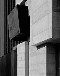


Helen Binet is a very successful architectual photographer, she explains her connection with these buildings saying, ''it’s like being a musician in front a big audience. You can’t get it wrong. In that instant, you have to be the best of yourself, you bring your mind to a place, not to lose that unique moment.” Her work is very interesting and makes me feel calm. The smooth edges of the buildings and straight lines within the photos cause each image to feel very peaceful. The lack of colour also adds to this affect as it makes the photographs more minimalistic. Her work is so aesthetically pleasing as the use of the geometric shapes are all so precise and thought out, you can tell when looking at the images how much work was put into these buildings. Looking at these photographs makes me wonder where these buildings are. They all seem to be isolated in a rural setting and in my opinion this contrasts with the aesthetic of the buildings and in some ways make them look out of place.
|
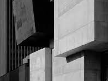
I really like this image. The overlapping layers of the building create shadows and different textures within the image. I think the solid shapes and black and white colors make the image seem so simple even though it is designed to perfection and was probably very difficult to build. I would love to know where this building is and who designed it. It is very different to anything I've seen before. The shadows and levels create a variety of shades and make the audience feel as though there are even more levels than there are. It is a really minimalistic yet interesting piece.
|
|

This image is a photograph taken by Helen Binet, her use of shadows and lighting is so unique and makes the photograph much more interesting. It also emphasises her use of shapes. The different shades of white, black and grey gives the photograph different looks/textures. I would love to ask Binet what this buildings is meant to be? It looks as if it’s in some kind of cave. Her use of space is also very interesting, the triangular cut out in the ceiling that creates a triangular shaped light to reflect through the image adds alot of dimension. The image is so unique to anything I’ve seen before and it is not seen in everyday life. I would love to view this image in color, I imagine it to be very neutral tones however it would be interesting to see if my prediction was correct.


These images are photographs I have taken inspired by Helen Binet. I do like the photos however they aren't very similar to the style of Helen Binet. Her photos are very obscure which means to be not clearly expressed or easily understood and are usually big objects that include lots of different greys, whites and blacks which is why I edited my own photos to be black and white however the structure of my images aren’t similar to Binet’s. I tried to take images that included lots of lines and shapes. Next time I would take images closer up and use more interesting lighting. I think it is hard to create images similar to Binet's because she has access to such uniquely designed buildings however I think taking photos from different angles and different heights will help create a similar illusion and new and oddly shaped shadows. The more I look at my images, the more they grow on me, despite not looking similar to Binet’s, I like that I have taken my own spin on her work and I think this is reflected through my use of straight lines and shapes.
Lucien Hervé


Lucien Herve was a Hungarian photographer, he was known for his architectural work beginning with his work in Le Corbusier. I really like his art because there is so much to look at in his photographs. The shadows within his photographs create an interesting dynamic between the different shades in the photo. He seems to take alot of photos using manmade objects such as bridges and houses, I think this is because he can use the different shapes to create the shadows and patterns seen within these photos. His photographs are very aesthetically pleasing, they are not busy and often include some kind of pattern or shape. Similarly to Helen Binet the lack of color adds to the feel of his images and encourages the audience to feel serene.


I really enjoyed responding to Hervé, while I was out I looked for geometric shapes and lines that created some kind of pattern. After that I edited all my images to be black and white, similarly to Hervés work. I think this created a really strong contrast between the dark and light colors within his work however in my opinion my images aren’t as contrasting because there isn’t as much shadow. Overall I am really happy with the result, taking photos outside of school showed me how many interesting buildings and patterns there are in everyday life.
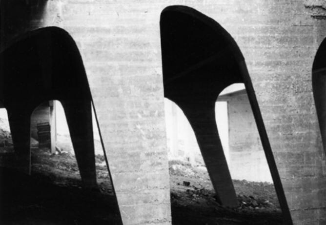
This is one of my favourite photos taken by Herve, I think it is a bridge, maybe on a beach however it reminds me off the heel of a shoe. The repetition of the arch creates a really interesting pattern, the smooth curves within these photographs is very aesthetically pleasing. Hervé often uses very unique structures and it is sometimes difficult to be able to tell what the image actually is however this makes the photograph more interesting because it leaves the audience with questions. Hervés work is very inspiring to me as he manages to take photos of things that most people wouldn’t give a second look and turns them into a piece of art that creates a sense of mystery.
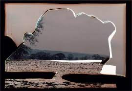
Dafna Talmor:


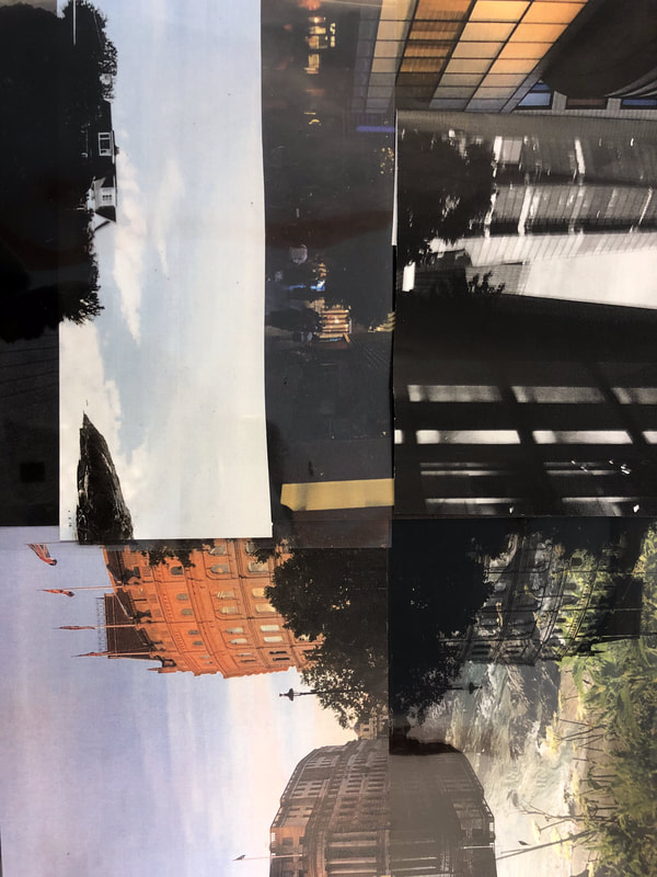
Dafna Talmor is a successful photographer, based in London. Her work has been shown in museums such as the Victoria and Albert museum. Her 'constructed landscapes' work is very interesting. It isn't always easy to tell exactly what she has photographed however all her photos follow a similar style, I really enjoy looking at her work, it makes me ask questions about where she took her images and how they turned out with the different borders. Dafna transforms color negative spaces through the act of slicing and splicing. She wants to create a ‘virtual space that opens up behind the surface.’ Dafna feels as though taking photos in outdoor spaces gives her endless possibilities and like there are no limitations. She took her landscapes of the different places she went in hopes to take a piece of that land with her. The photographs taken over several years in Israel and Venezuela have formed the basis of her project. The way she disrupts her images is unlike anything I have seen before. To me these images look as if a plastic border has been melted around them, this reminds me of how plastic affects our world and although this was not Talmors intention, it does build up emotion as we are reminded of the damage we have caused to earth.
|
I chose this image because I think it is the most interesting, the border around the photo is really unique, it looks like melted plastic. I think the image would be even better if the background picture was more colorful because it would stand out more. In the image I can see a beach with trees in the distance. I think this image is constructed from only one landscape however it looks as if it has been burned or melted around the edges. Dafna manipulates and plays with her landscapes. She experiments with montage, collage and multiple exposures until she is happy with her result. I love that she is so enthusiastic about what she does and really enjoys her work.
|
Corinne Vionnet


Corinne Vionet takes thousands of images of famous landmarks throughout the day and then merges them together to give the illusion that they are moving. I love her work and I think the approach to these photographs takes alot of patience and determination. Her work gives these landmarks a whole new perspective. The photos look as if they are moving because they are blurry after all the different images were merged together. I think this is why the artist took the images in this way. You could merge two images together that are the same however taken from slightly different angles at the same time so it was as if you were looking at the same photo from different perspectives. Two versions of the same image. Personally I would love to take photos of the Eiffel tower because it is made of many different shapes and it is very tall so it could be taken from different angles and still look interesting. Her idea is very unique and the outcome is incredible, it highlights the beauty of each landmark.

I chose this image because it is the most interesting, it is different from the others because it is taken very high up and instead of being surrounded by people, it is surrounded by buildings, I really like the style of these photographs, it is a creative idea however I think it would take a while to complete because of the amount of photographs you would have to take. The photos look almost as if they have been drawn, the blurred lines and edges creates the illusion that the city is almost moving. I would love to know photo was taken from to be able to fit the whole building in the shot.
Charles Wilkin
Artist statement:
‘My work is a loose collection of thoughts and observations in many ways and less about one specific theme. I see it as reflecting the world we live in, with all its ugliness and cruelty. But from that, I strive to extract the beauty and empathy hidden underneath and within us all, revealing the unknown, the unspoken and intangible things that make us truly human. For me, collage as a medium replicates this frenetic and inherent collision of people, culture, and emotions we all experience. I believe the true meaning of my work is derived directly from the intertwining of these associations, and the spontaneity of my creative process. This gives my work the freedom to live creatively in the moment, and the ability to respond to current events, despite my imagery being derived primarily from vintage magazines’.
‘My work is a loose collection of thoughts and observations in many ways and less about one specific theme. I see it as reflecting the world we live in, with all its ugliness and cruelty. But from that, I strive to extract the beauty and empathy hidden underneath and within us all, revealing the unknown, the unspoken and intangible things that make us truly human. For me, collage as a medium replicates this frenetic and inherent collision of people, culture, and emotions we all experience. I believe the true meaning of my work is derived directly from the intertwining of these associations, and the spontaneity of my creative process. This gives my work the freedom to live creatively in the moment, and the ability to respond to current events, despite my imagery being derived primarily from vintage magazines’.


The multicoloured shapes look a bit like different colored/patterned clothing, they also seem like they are separate materials as they look like they are all different colors. Personally I think the artist placed the multi colored shapes in this particular way to give the abstract appearance that there are people on this landscape as that’s what it reminds me of. The shapes don’t really make sense, they look very random however Wilkin has spoken about wanting to celebrate people’s culture and what makes us human and I think that it his reasoning for all the different types of patterns and materials. All the shapes have been placed in the center of the image and I think Wilkin used the plain looking backgrounds as a contrast to all the colors used as a celebration of different people/personalities/cultures.


I have taken these landscapes to use as the background of my piece inspired by Wilkin. I took them around school so I was limited to where I could go and the weather wasn't very nice so the lighting is not very interesting. I am going to take some more photographs when it is sunnier and outside of school and then use my favorites for the background of my work. I do not like these images, they are unfocused and seem rushed. To improve these images I would take more colorful photos with better lighting and with more variation to create a bit more life and interest in these photos. Taking these photos showed me that photography is all about trial and error.


I retook the images on a brighter day and I much prefer them, I prefer the angle they were taken at, the color scheme and just the photograph in general is alot more aesthetically pleasing. In my opinion the symmetry of each photo and the use of shadows and lighting creates a sense of origanisation furthermore within the photographs there are a lot of straight lines and rectangular shapes which I really enjoy looking at.


These are images I created in response to Charles Wilkin, although I like the colors of the material I don't think they match the colors in the photo and therefore look abit out of place. I also used cut outs from other photographs to add to the collage. I like the use of these cut outs in the first image because it looks abstracts however I don't like how obviously the circle stands out of the image in the last two. Originally I thought that in the future I would use colorful but more neutral versions of the material however as I compare my work to Wilkins I notice that he uses bright material which really stands out in his work and this inspires me to look at my own work in a different way and notice that the obvious differences in colors between the photos and the material can be a good thing. Working with both material and photos was a different experience and although I faced some challenges such as the paper continuously ripping, it was really enjoyable to pushed outside of my comfort zone and create work so different to my previous projects


Before adding material to these photographs I decided to experiment, manipulating the images by cutting different parts out and changing the orientation of them. After this I also decided to use the photocopier to incorporate a singular color into my work. This was harder than I imagined because each time I tried to do this, only half the image would print off and I was left with alot of plain paper. These images did not turn out how I expected them too and in my opinion they are not my best work however I think it is important to try new things. Furthermore doing this showed me what to improve on next time and that in photography, things do not always go to plan and it is all about trial and error.

|
|
After retaking the photographs for my Charles Wilkin response I decided to experiment with photoshop and edit them. At first I found it really difficult to use and I couldn't manipulate the photos the way I wanted to however as I continued trying I created these two images and although they aren't what I originally planned to create I really like the outcome. I really like the layering and how the walls in the second image align. Furthermore the railings at the bottom of the first image seem to almost reflect the railings at the top of the second image and I think this mirror effect looks really interesting.
Landscapes:


These images are photographs I have taken in various different places. I really like them because they are all in very beautiful/natural scenes. I may include some of them in my project. The are so many different colors in each photograph, each is so bright and the photographs are all taken in places I really love and so each one is meaningful. I think these photographs highlight the difference between urban and rural landscapes. The business of the city and the peace of nature, both very beautiful. I really enjoy taking photographs that are full of color and life while I am out, it is so special to be able to look at an image that brings memories with it.
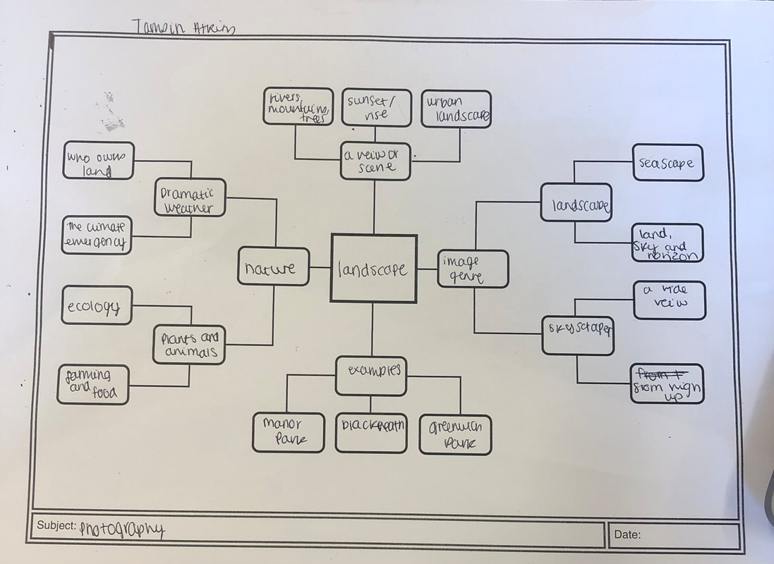
This is my mind map of all the ideas and places I can think of that relate to the idea of a landscape, this task was really helpful to inspire me for future project ideas and photographs I want to take. When creating this mind map I wrote down everything that came to mind and I think this technique was effective because it encouraged me to embrace all my ideas, good or bad and showed me that writing down my ideas helped me to think of new ones and more developed versions of my original ideas.
In school landscapes:


Today we were set a task to take photographs within the school of landscapes, not including any buildings or people. I like these images however they seem abit rushed and they are all very similar because they were taken in similar places. I tried to take them from different angles and heights to include some variety. I think the angle of some of the photographs could be more precise but overall I think they are ok considering they were taken in a limited area. I like the greenery, the colors are very bright and give each photograph a happy and natural feel, I think it is nice that you can see far off into the background of the image and they are taken at different heights. In the future I would include different aspects of the school site instead of just the field as I think this would show some more variety in my images and make them stand out more.
Landscape images:


This week we had to take photographs of landscapes throughout the week. I really like most of these images, I love the colors in them and but some of the photos do include buildings which I don't love when taking landscapes as when I think of landscapes I think of nature and greenery. Buildings are often neutral colors that are man made and don't necessarily fit into my idea of a typical 'landscape'. In general all the images have a lot to look at and I have used different angles and lighting to create different moods within the images. My favorite image is the second photograph because I love the arch, I don't have many photographs that look like this and include shapes similar to this one.
Awoiska Van de Molden:
Awoiska Van de Molden, born in 1972 is a Dutch artist, her main work is based around photography. Her black and white images are an attempt to 'return to the place from which we stem'. One of her exhibitions 'Hope' is touring world wide until 2021, she has won many awards and travelled around the world taking her photographs. Her desire is to try and take photographs of pure nature, for all her sense's to be aware of her surroundings only, she is aware of the advance humans have made in technology however wants her body and mind to still be in touch with nature and its inner beauty. Van de Molden spends hours in absolute solitude to take in the pure beauty of the landscape she photographs. Very few travel back with her to be hand printed in a dark room. She wants others to be in touch and see the world through her eyes, the pure beauty of nature.


Awoiska Van de Molden is a landscape photographer, interestingly she doesn't actually enjoy taking landscape photographs. She takes these photographs because each place brings her peace and has a special place in her heart, she feels very comfortable here. This is one of the reasons why she doesn't tell people where these photographs are taken. She wants people to enjoy the photo's and not judge them based on where there taken or the news surrounding the area. In my opinion Awoiska Van de Molden's photographs are very pretty, I think the area in which they are taken is very beautiful and the scenery is incredible however I don't think overall they are very interesting. They all seem very similar, they are all black and white and I don't think I can capture the true beauty of this place through a photograph.


To make response to Awoiska Van de Molden I edited photos that I took in Nepal to be black and white to match her theme. I choose these photos because I felt like there natural feel really resonated with her. I really love these photographs, not only because it was such an amazing experience to be able to see this first hand but also because I love the contrast between the mountain tops and the sky and the clear edges and ridges of each side of the mountain. Although back and white I like the gradient of colors and the variation of light. Each of these photographs are taken in a place very special to me, going to Nepal for three weeks and trekking through the mountains was such an incredible journey and although it was difficult at times and challenged me physically and mentally, waking up to views like these really made me feel at home, it was so peaceful. Looking back at these photographs is a rollercoaster of emotions, I feel so grateful that I was able to travel to Nepal at such a young age without my parents and experience a world so different to my everyday life, however it also makes me sad as I miss the people I met there and the trip in general, it was a once in a life time opportunity.
Luke Saxon:
Saxon is a photographer based in Rochdale, England, he owns a photography degree from the university of Central Lancashire. His photographs are predominantly based on diptych, street photography and collage. This project ' The same but different', is based on exploring the contrast in ethnicity and class throughout Britan. He takes these images mostly in Rochdale and other northern towns. Personally I didn't think there were many photographs displaying the difference between these two things however alot of the photographs included two images, one to do with nature and another to do with plastic, this contrast could be to do global warming and the affect humans have on earth.


|
In this image I can see half a cat and half a plastic bag, the images have been put together to look as one, it is a very abstract image, and i haven't seen something like it before. The idea of making two images look as one is so interesting to me, the photos go together so well and the cat looks whole even though it is not. The photo to me looks as if the cat is the walking dead, the second photographs almost looks as if it's the skull of the cat. I also think the difference between the two images backgrounds add alot to the photograph because the cat and the plastic fits together so well and the backgrounds are so different. If i could ask Saxon about his work I would ask how he came up with this idea. I think the whole photograph fits together really well and the overall concept is very unique.
|
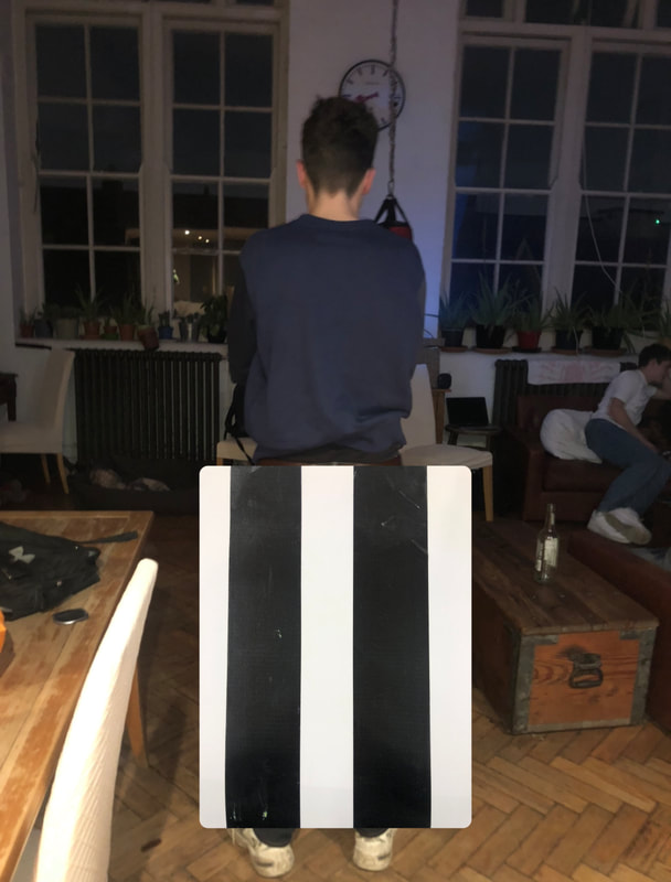
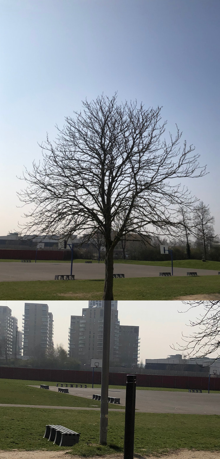
These photos are my response to Luke Saxon, to create the first image I photographed to strips of black duck tape that I found on the wall and I realized that they aligned with a photograph I took of Josh. I decided to edit these images on instagram so that the duck tape looked to be his legs. I do like how it turned out but I think it would look better if there wasn't so much negative space in the photograph of the duck tape as this makes the image look very obviously edited. The second image is a mixture of a lamppost and a tree. This one blends in more and looks less edited because both photos have a similar background however there isn't much to look at and it isn't very interesting. I think if I spent more time choosing which images to use I could create a far more natural looking piece that involved contrast but also worked well together.
|
|
Collaborative collage:


Last week we collaboratively made a collage using landscape images we had taken, today I rearranged a few of them into a way I liked. I tried to use images where the lines continued onto another image so that they seemed as one. Doing this reminded me of Luke Saxon's work as he also used multiple images and tried to use similar lines from the images as if they were a continuation of each other. I think I did this successfully and I like how it turned out however I don't think all the images necessarily go together very well. My favourite one is the third photograph as I like how the two buildings link together, it’s almost as if they are one. I also like the contrast of color in the sky as if one image is taken during the day and one is taken in the evening. I experimented and changed the order and positions of the images on the wall until I found an arrangement I was happy with. Using the photographs to make a collage that linked together well was hard but also interesting because it forced to look at each part of the photos in order to place them nicely. It reminded me of doing a jigsaw puzzle however there was no right or wrong answer which to me is what photography is all about. There is no definitive answer in photography, just you opinion and views on different topics and art/photos.
Disrupted images


Today in class we were set the task of taking photographs throughout school. My favorite image is the the seventh one, I love the symmetry of the two buildings and the bright green grass really brings the photograph together, to further develop these images we were given the task to disrupt these landscapes so I took some photographs through a clear sheet to make them blurry. You can see how this worked in my last four images. I think it was a really interesting idea and although I like how they turned out because they look quite eerie I think they would look better if they were taken in a brighter location because the colors would shine through more. I would love the continue experimenting with disrupting landscapes. In the future I could use different colors of this material to not only change the focus of the image but also the color.
Landscapes in London:


These are images I have taken throughout the week, in London and Blackheath. I like the last three images most because in my opinion they are the most aesthetically pleasing. The first six images are not my favorite. They look very boring, there are no exciting colors and I don't like the angle I have taken them at. In the future I would take photographs on a sunnier day because I think the rain in these photographs gives them a very melancholic vibe. I would also experiment using different filters and a wider variety of places, it would make the photos much more interesting.
Making day:


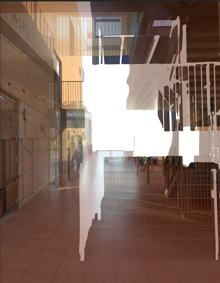
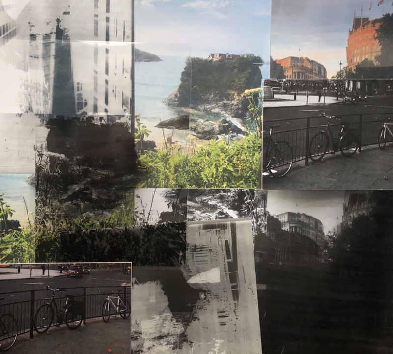
I used these three images that I had taken in different places, the first two in London and the other one in Cornwall. To print onto acetate paper as shown below. I really like how different these images are, I think the first one is very contrasting in comparison to the last one because the first image in London by Trafalgar Square looks very busy and full of life. You can see lots of man made buildings and overall it is just very obvious that this photo was taken in a city used by many people, this is shown through the amount of transport that can be seen in this photograph. I really like this picture, I think it is very aesthetically pleasing and it makes me feel very grateful to live so close to London. However in comparison the last photo is almost the opposite. This photograph was taken in Cornwall, I was so fascinated by the house on this random island. Although it can’t be seen in this photograph behind me was a street of restaurants filled with people. At the end there was a beach and this small island. I could not see any sign of human life in the house however to get to it you had to cross an old and breaking bridge which did not look very safe. I was so intrigued and had so many unanswered questions about this random house. Did or does anyone live there? How long has the house been there? What would happen if the bridge broke? Why was there a house on this small island?


These are the images on acetate, they look better in person because they are very shiny and therefore reflect the light. To make these I just reprinted the images onto acetate paper. I really like the result, the different shades and parts of paper negative go really well together. If I could re-do it, I would use some brighter images so that there won't be so many dark spaces but overall I am really happy with the result.


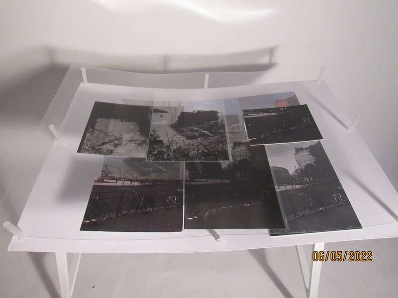
After printing these images onto transparent paper I went into the darkroom and layered each image so they became a collage of one. I did this using safelight paper and light and then submerging the paper into different solutions. This is how they turned out. I really like them, I think the contrast in scenery works well together and the different shades of grey, black and white compliment each other. It was really fun experimenting with the darkroom because it is something I don't use very often. I love the solid shapes in these outcomes and that you can't necessarily tell what each photo is.

This is my favorite image, I like that you can still see the buildings but there are lighter parts of the shard or bushes/trees overlapping it. It is a really interesting thing to look at however because it is in black and white it isn't too overwhelming. The contrast between the black and white really stands out. As I created these images I realized the longer you left the safelight paper in the solution, the darker the photo turned out. I experimented leaving it in for different amount of times to see the difference. I had to be careful not to leave it in for too long otherwise the photo would be too dark and nothing would be seen. It reminds me of an x-ray because of the colors and you can only see the structure of each building, as if your looking at the core structure of these architectural designs.
Constructed landscapes collage:


Today I used the three images from last week, the colored, black and white and the paper negatives to create different collages. I really like how they turned out, I think the contrast in colors go well together. some of the images I made half black and white and the other half colored as I had multiple copies. I think the result is really interesting as there is a lot to look at. Some of my inspiration for creating this piece was Dafna Talmor, her use of paper negatives and landscapes were so distorted and interesting to me. Although a lot of these collages were my own idea and the style of them are not very similar to her work, the overall idea/theme is the same. Combining paper negatives and landscape images to create a piece of art/photography. I really enjoyed playing around with the spacing of each image and being able to create multiple different outcomes.

This is my least favorite image, you can clearly see the line where the separate images overlap. I don't like the shadow in the middle and I think overall it is just very boring, There isn't much to look at and it is not complex at all. Next time I would overlap another, more colorful image or a paper negative to give this collage more personality however I do like that at the bottom of the image it almost joins together and looks as one except half is colored and the other half is not.

|

|

|
|
I like these four images, the different places and colors compliment each other and the greens, oranges and blues really remind me on nature. The colored images poking through the paper negatives gives the audience a lot to see. It was difficult to get all the images to be straight as they stuck to the paper negatives so next time I would use blue tack to keep the images down. Overall I think this was a really effective way of showing off my landscapes and ability to experiment with a variety of different techniques and processes.
|
This is my favorite image, I love the reflection of the buildings. I cut an image taken in Cornwall in half and another image taken in London in half. I placed half the photo from Cornwall underneath the paper negative of the London photo and then the other half of the London upside down, on top of the paper negative. I think that the difference of the sea and greenery against the busy city of London emphasizes the differences between the two places. I also really like that the top half of the image is filled with blues and greens however the opposite half is oranges and blues. Overall I really like how it turned out, two completely different images are now linked through the reflection of one of them. The contrast of the colors and landscapes are very aesthetically pleasing and in some ways I feel as though the buildings are being reflected on the water.
|

|


This is the result of my making day and an outcome to 'constructed landscapes', I am so happy with how is turned out and although it took alot of determination it was definitely worth it in the end. There were alot of challenges when creating this piece, such as when I decided to make this piece 3D I had trouble figuring out what to use to hold the second platform up. I didn't want to use anything that would distract viewers from the main focus of my collage or anything that would look messy. After thinking about it, my teacher came up with the solution of using hot glue gun sticks, they were the perfect size and practically transparent so I hoped they wouldn't be too noticeable.
To go about making this piece I first printed of images that I liked from my camera roll and then also printed them in black and white so that I would have some variation. I also printed out multiple copies so that I would have enough to manipulate and experiment with. My teacher then helped me print each of these images onto acetate paper which created an unusual, transparent piece. Once I had made the acetate's I went into the darkroom and experimented, layering these different acetates and then leaving them in the developer for different lengths of time until I was happy with the result. I did this multiple times so that I would have multiple outcomes. Using the darkroom is not something that I do very often so it was really interesting to be able to experiment in there using my own images.
After this I cut up and stuck the original images that were in color and in black and white onto card. This was also challenging because the card was so thick that it was difficult to cut around the image precisely but I got there in the end. Once I had done this I placed all my images, including the acetate and the darkroom outcomes onto card and arranged them in different ways. I didn't always like how I arranged them but I spent alot of time thinking about what order looked best and also what incorporated the most of the different styles and showed off my ability to it's full extent. Eventually when I was happy with how it looked I chose which images I think would look best on the second layer and placed them to the side and then I stuck the base images down onto white card.
After this I retrieved the glues sticks from the art department and began measuring them so that they were all the same size, my teacher then helped me cut them to size. I then used a hot glue gun to stick them onto the edges of the card, originally I was only going to use four but this was not strong enough to hold up the second layer so I ended up using six which was much more effective. Later on when the glue stick's were dry and sturdy I placed hot glue onto the top of them and placed my sheet of acrylic on this. This was difficult as I had to make sure each edge aligned at the same time. I then left this to dry. When I knew it was dry I placed the second layer of images onto the acrylic so that it almost looked as if this layer was floating.
I really liked how it turned out but the next obstacle I faced was photographing it. Because I used so many different materials which were all so reflective, it was difficult to get a good picture of it, I also struggled to photograph it and show that it was 3D and not just a normal collage. To fix this problem I used the white backdrop in the classroom and made sure there was not natural light to reflect of my piece by covering up all the windows. I then set up the lights in the photography room and a teacher showed me how to place the light to create shadow and show that this collage was 3D. I had to stand on a chair to take this image from head on but I think it worked really well. There is still some reflection and I don't like that you can see the dust particles and any dirt/staining on the acrylic but that can't be helped. I did have to clean the sheet of acrylic before I glued it down as it was so dirty.
I also took photographs of the set up and not just the collage to show the process of photographing this piece and also what it looks like from different angles. Overall I turned out really well in my opinion and taught me how to be resilient and persevere even when there are so many challenges and it feels impossible to overcome them. I am so glad that I continued with this project and actually bought my own idea to life. I am very proud of my work and it was so enjoyable to use so many different materials and techniques that I haven't used before. I also really like that all these landscape images are my own and that I got to incorporate such a variety of skills into one piece.
Fong Qi Wei:
Fong Qi Wei is a photographer based in Singapore. His project 'Time is a dimension' where he wanted to catch a series of movements in a single image. He would take photos of the same landmark throughout different times of the day and create these motion images, made up of different shades and colors of the same image. I think his work overall is a really interesting construct. It emphasizes the change in color throughout the day. Fong Qi Wei would draw geometric stencils over the landmarks and create layered animations where the colors would expand out from a central point. Each unique animation displays the different times of day.


|
This image is my favorite overall because I like the movement below on the road even though the buildings are still. The difference in shades really changes the atmosphere of the picture. As the night falls the tones within the image are yellows, oranges and blues and the picture feels much more modern however during the day when the image consists of very neutral colors and to me comes across as more old-fashioned. Overall I really like his work, it is such an interesting idea and very unique. The different times of day present two completely different and unique atmospheres, one comes across as very sophisticated and calming whereas the other is really reminding me off night life and parties.
|

|
Mickalene Thomas:


Mickalene Thomas is a contemporary African American artist, her most well known work is based of African American woman and there power and femininity. Her work is often influenced by pop art and pop culture. She has also create images based on landscapes, still life and portraits. These are Mickalene Thomas landscapes collages. I really like them because they are very abstract, her use of color is intriguing. She uses blues and greens to emphasize the nature of her images. Although the landscape collages do provide much to look at and the creation of them fascinates me, I think the artist could cut each piece of paper more precisely so that they fit together better. Some of the placements of the bushes/trees look out of place or as if they are the wrong orientation. Mickalene may have done this on purpose to make each image chaotic and abstract however if I created work inspired by her I think I would change that. Overall I do think her work is beautiful and creates a very green and nature full picture.


This is my response to Mickalene Thomas, although it is different to my usual work I really like how it turned out. To make this I printed of any images in my camera roll that were filled with greenery and just general landscapes I liked. I then decided to cut around any bushes and greenery I saw. Instead of planning what to cut out and where I wanted to go I decided to just freestyle and follow my intutition. I was really happy with the result of this and would definitely try this again. After sticking down some of my cut outs I took another look at Mickalene Thomas and realized that she had almost no negative space in her outcomes so to fill any negative space in my images I cut out different shapes in blue and green card and stuck them on the card. In the future I would use a landscape photograph in the background to insure that if there were any gaps they were still filled with some kind of landscape.
Constructed landscapes


For one of my final pieces for constructive landscapes I decided to make a collage from photographs inspired by this theme. I think I successfully did this as I made collages using landscapes however constructed them with other photos and cut outs. The photos above are from the beginning of the day when I had just began experimenting with my photographs. All the images used in this collage are my own except the cut out of the two people standing which is from a magazine from a previous collage and some of the cut outs of greenery. I wanted to experiment with combining landscapes of buildings with nature photos and sometimes people.


I then created the first collage, I really like how it turned out, I had to use alot of trial and error and play around with where different cut outs should go, overall I really like how it turned out, I like the colors involved and the aesthetic of this collage. My favorite part of the first collage is the cut outs of the people, I like the negative effect that it gives the photograph. I also stuck the cut outs of my friends next to where they originally were and I really like how this looks because it almost looks like a reflection. After creating the first image I moved onto creating a second collage. I printed out new photographs and also photocopied my original collage so that I could use some of the cut outs from that one. I like how it turned out however I prefer the other one, my favorite part of this image is the shapes, I like the combined use of curves, straight lines and circles, I think it gives the image more variety and creates contrast within the image.


To then further develop my work I photocopied it using different colors. This was a challenge because it kept printing the same color as seen in the middle image, instead of overlaying it however I eventually figured it out and it worked out really well. For the first collage I used red and navy, before printing the navy on I flipped the image so that it gave a reflected affect. I really like how it turned out. For the second collage I printed purple and then magenta however the two colors combined because I didn’t flip the image in the photocopier I still like how it turned out and I think it gives the image a blur effect. To further develop my idea I want to incorporate all the collages into one to make one big collage including the original and the colored copies so that there is a mix or reality and color.
The Agoraphobic Traveller


Jacqui Kenny suffers from a mental illness called agoraphobia, this means she has a fear of leaving her house, despite this she still manages to take beautiful photographs from all over the world from within her own home. She does this by taking screenshots of different places such as Mongolia, Senegal and Chile on google earth. She was able to experience places all over the world which she had never explored. I really love these images, I think they emphasize a beauty of the world which most people will never experience, the color within the photos are incredible and the whole atmosphere makes it feel as if you are really there. I think it's amazing that despite her mental health, Kenny is still able to do and share her work. The fact that she is still able to explore the world and learn about new places and cultures is so amazing because it shows how far the world of technology has come.


These are my images that I screenshot on google earth, I do like the outcome however I would have liked to include more colors. My favorite photo is the 3rd one because I like the isolated house in the middle and the mountains in the background, it reminds me off the pink house in Kenny's photo. My least favorite one is the 4th one because there is not much to look at and the image is quite unclear. I like the colors in the 2nd because they are bright and eye catching, the different textures enhances the surroundings. It was really interesting to explore the world while sat in my chair in photography. I used google maps and decided to drag and place the person in the corner randomly because I thought this was the most effective technique to finding images that were the most different to where I live and my everyday lifestyle.
Collaborative collage:


Yesterday we were put into partners and given 5 images, we were then given 20 instructions to follow that included cutting holes in images, tearing images and overlapping them. I took photos of what my images looked like throughout the process and in the end we made collages with the photos and pieces we had left. Although this is not how I usually create collages, it was entertaining to work with my friends on a project and the final piece is unlike what I have made before. I also like that this was not inspired by an artist and that it was just created using my imagination and the instructions we were given. It really shows that photography is based on chance and that not all our outcomes and images and planned but that does not mean they are any worse than the ones that are thought out and planned.


After finishing my collage I photocopied it in 2 different colors however before photocopying the second color on top I turned the photo around so it would be reflective. I repeated this multiple times so that I would have multiple outcomes. I don't like the orange and pink one because the colors are so similar that the outcome isn't clear. My favorite one is the purple and green one because the colors are so contrasting that the reflection is really obvious. The reflection almost looks as if two people are walking away from each other, this could represent conflict and seems to give the photograph a story which could create questions for anyone observing this photograph such as what is happening in the photo and what is the story behind it?
Pacifico Milano:
Pacifico Silanos work is inspired by celebration gay culture that comment on 'loss, longing and queer melancholy.' Silano frames and crops his art to display the crisis of HIV/AIDS and the consequences it has on queer lives. I really like his work and the mixture of images, inspired by this I photocopied an image I took in different tones/shades, cut them into strips and then mixed them together, although the idea is simple I really like the outcome and want to develop it further. Pacifico Silanos work makes me feel intrigued, the mixture of images make me wonder why he chose these specific images and if they have any connection.


Instead of creating a book including a mixture of images I decided to take inspiration from Pacifico Silanos work and use the same image in different tones. I printed the same image five times in different filters, then I cut them into strips and blended them together to make one whole image. Despite it being different to Silanos work, I like how it turned out because it reminds me of an image being taken in the same place at different times or even in different years. To develop this further I would repeat these steps however instead of printing the photos in different shades I would print them using different colors. I think this would look really interesting because it would make the photograph really bright and you would be able to see a really big contrast in each section.
Inspired by Pacifico Silanos, I created a video with a mixture of the videos I have on my camera roll of landscapes. Although it didn't turn out how I planned I do like the overall outcome. If I was to do it again I would create more of a transition between each video, maybe I would experiment with creating a fade between each video because I think it would make it more smooth. I would also want to add an effect to the video's to make them look more vintage even try overlapping videos. Overall I think this was a successful way to portray my landscapes that weren't just photos and also a good way to create variation between my projects.
Sustainable darkroom workshop:
The sustainable photography project is an artist run programe which creates and encourages others to create sustainable chemigrams, they use natural resources such as rosemary to make developers and then use oil based products such as sun-cream, oil and vaseline to make different colors and spaces on the chemigrams. Sustainable photography is very important especially in this day and age because climate change and global warming is a big issue and using these natural resources is a much more environmentally friendly approach. As more people discover the amazing art you can make with sustainable products I think it will become used more widely.


To create these chemigrams we firstly boiled rosemary and lavender to make the developer then using leaves, plants and brushes we collected outside we printed sun-cream onto the light sensitive paper to make leaf like shapes and other patterns. The advantages of making a sustainable developer is that we are not using harsh chemicals that damage the environment and wildlife. This process could be further developed by creating the chemigrams on a bigger scale or using different natural materials such as bigger flowers and branches. I could further develop this to link it back to past ideas by creating many different chemigrams of leaves and then altogether creating a collage out of these chemigrams. I really enjoyed this workshop, it pushed me to experiment with photography in a way that I never have before, alot of the constructed landscape project has been inspired by nature however I have never thought of using nature to create my work although it was a messy process it was so much fun. Despite everyone creating there images in the same way there were so many different outcomes and depending on what kind of barrier you used there were many different colors. The result of these chemigrams remind me of acid and also like an x-ray.


These slides are ones I have taken and modified to make my own, I think the outcome could be improved because I don't think the result is ascetically pleasing and in my opinion it is all very messy. I like the strip of purple along the bottom of the slide however I think the card on top looks out of place and the yellow color doesn't compliment the purple. If I could do something different next time I would only use one color and instead of cutting bits of the slide out I would scratch specific places such as outlines instead of randomly. I would also like to use a different slide that involved more geometric shapes because it would give me more to work with. I do like the idea behind this and i think it could be really interesting with some more practice. It was also really difficult to edit the slides because they were so small. When photographing this I asked my friends to hold different pieces of card against it to create shadow and texture.
Landscapes:

|
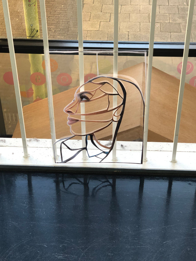
For one of my final projects I was inspired by Sharon Walters and how she manipulated portraits by cutting out outlines of peoples faces and using different landscapes as the background, the photo on the left is one of my favorite pieces by Walters. Inspired by this, I decided to photograph Rhianna's side profile and then using a scalpel cut it out so that only the outline of the picture was left, this is shown below. Although satisfying, it was difficult to cut out such thin lines without ripping the paper and required a lot of focus. To decide where to cut I followed the contours and lines from the photograph itself, this was effective as it gave the final result a more natural effect.
|
After finishing the cut out, I stuck it on a clear piece of acrylic using sellotape, then using my phone I placed the acrylic against different objects and photographed it. I really like the outcome and the fact that in some photographs the acrylic is more difficult to notice than in other photographs. I think the sun and use of light within each picture enhances the colors of the background and is overall more aesthetically pleasing. I love this idea because its similar to Sharon Walters, an artist I researched during the make do and mend project, as I used her idea of cutting out a portrait so that it was made up of just a line however instead of then sticking the outline onto a landscape, I photographed it in landscapes and I like that this gives my project its own spin.


|
This is my least favorite image, I don't like the background and I think the location is just very boring, there is nothing to look at and no interesting colors, furthermore the angle that I took this photo is very unnatural. The bars behind the acrylic are wonky and their is dust on the shelf behind
|
|
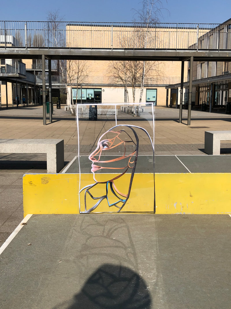
This image is my favorite because I really like the bright colors, such as the yellow within the image, I think the shadow reflection of the image on the table tennis table is really interesting. In my opinion it is the best one because it is the most enjoyable to look at and the most aesthetically pleasing, if I could change one thing I would want the collage to be in the middle of the photograph.
|
|


I decided to retake these images in portrait with the background out of focus, I also thought that including Rhianna in my photograph would make it really interesting and allow the viewer to see who this collage is of. I don't like the third image because the outline is blurred and some parts of the background are in focus, however I like that these photographs give the viewer a close up of view of the fine details of the collage of Rhianna. To develop this further I want to print actual images and photocopy it with the collage in front of the image. After this I want to print the images in different colors.


Here I photocopied the outline of Rhianna onto a landscape taken from my window, I copied them in different colours blue, green, purple and pink. I like the pink one because I think the double effect of the outline looks nice. Originally I didn't like how the third image turned out as it went wrong during the process of photographing them however as I look at it more the more I like it because I like that the purple can only be seen in certain areas of the image as it gives it a very distorted look. If I was to do this again I would use a different background that had more negative space as I think the image of Rhianna would be more clear.

|
After printing this collage onto other landscapes in different colors, I decided to try and emphasize the detail of the outline of Rhianna's face as in a lot of my images it is unclear. To do this I placed the cut out on the light box and placed two pieces of A3 on top of it to ensure no color could be seen. I then turned of the light box and the outline of the face was shown on the paper.
|
|
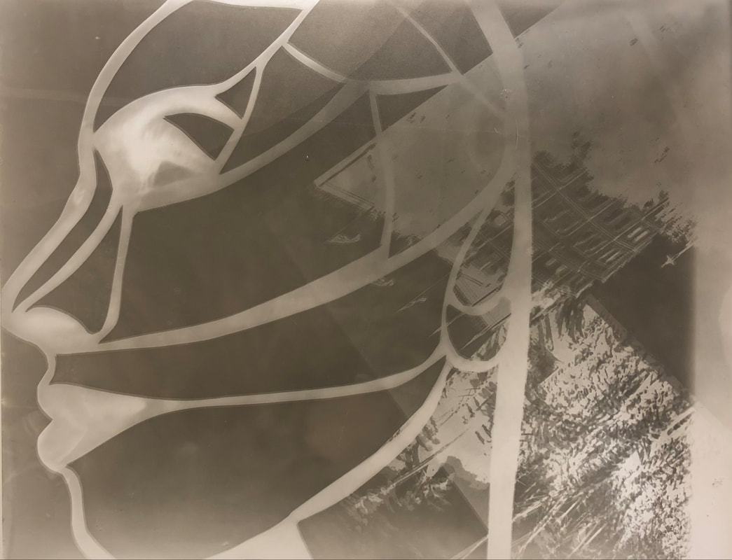
After making this silhouette with the light box I thought the inverse of it would look really interesting. To do this I put the cut out onto of the acetate paper and then shone the light on it in the darkroom. After this I put the acetate paper in the developer and waited for it to dry. To create the buildings and plants on the side I placed acetate from a previous project onto of the photography paper along with the collage. I really like the outcome of this. I think its really interesting and I love the clear contrast between the background and the outline of Rhianna's face. I also like that the background fades out so that you can clearly see the details of her face. Similarly to the workshop that involved chemigrams I think it almost looks as though it is an x-ray of Rhianna face which I really like.
|
|


Today I decided to experiment with the projector and different materials I found around the classroom, I photographed my friend Eve sat on a stool and positioned the light directly on her which was effective because I think it highlighted her different features well and created shadow within the photograph. In some of these photos I have projected a church behind her, this was to include the idea of landscapes and create some contrast within the photos. I really like how all of these turned out. I also experimented with filters from my camera just to highlight the colors or contrast of the photo and I think this looks really interesting. I especially like the black and white images because you can really see the shadows and tones in the photo. I enjoyed using the card with cut out shapes because it broke up the image a bit and I think it is overall just an interesting piece, I also used mirrors, acetate, colored plastic and my own photos.


To further edit my images I used an app called VSCO to change the saturation and highlight certain features of each picture. In the gallery above you can see the before and after. I played around with the different adjustments until I was satisfied with the result. I like the outcome of these however I feel as though I could have done more to them and the differences are very subtle.
Edited Images:


After using VSCO to edit images from a previous project, changing things such as the saturation and brightness, I decided to see what other ways I could edit my images to make them more interesting. I downloaded an app on my phone called picsart. This allowed me to layer images on top of one another and change things such as the color. The images above and just some experiments using photos from my camera roll. To create the first two images, I layered multiple photos on top of the background image and then cut out different things from these photos, then using these cut outs I adjusted the size and placed them on the background photo until I was satisfied with the result. For the last image, I layered the same photograph multiple times, each time changing the color, I then cut out a section from the photograph and placed it on the original photo so that it fit perfectly. I really love the outcome of these, as it can change the image to look entirely different and more interesting only using technology.
