Introduction to edges:
Edges is a topic that has a range of concepts and ideas, everything has edges and edges are everywhere. This means when learning about edges we can take photos of virtually anything. There is also a lot to learn about edges because it has such a big topic area, we can learn about edges without even realising it, we see edges all the time everywhere.
Jerry Reed: Francis Brugiere:


SIMILARITIES:
*they are both up close
*you can't really tell what each of them are
*they both have a lot of contrast
DIFFERENCE'S:
*the first is only black and white while the second has grey, brown, black and white tones
*the first one has sharp corners
*the second is 3D and the first is 2D
*they are both up close
*you can't really tell what each of them are
*they both have a lot of contrast
DIFFERENCE'S:
*the first is only black and white while the second has grey, brown, black and white tones
*the first one has sharp corners
*the second is 3D and the first is 2D
To remake Jerry Reeds' image I would get black card and then cut out the same shapes of the white using white card. Then I would arrange them so that the white card was on top of the black card and so it looks similar to the Jerry Reeds' image.
To remake Francis Brugieres' image I would fold and rip the paper in a certain way then used torch to convery the contrast in light.
To remake Francis Brugieres' image I would fold and rip the paper in a certain way then used torch to convery the contrast in light.
Noticing the light:


What did I do?
I started with the first picture, I measured where each different point started and stopped and then shaded them in accordingly. The second picture was harder, I picked a point to start from and then builded on it from there. When I had the main outline I started adding shading. Then using my finger I blended the pencil marks out. I used a rubber to add the lighter parts.
Why was I asked to do it?
I think I was asked to do it to help my concentration and also encourage me to look at small details. This helps me look into photographs more and notice things like positioning and the angle the light is coming from.
How did I feel about it?
I found concentrating hard and I was very achy afterwards but it was quite relaxing. it was very annoying because if I drew one thing then I would realise something else was in the wrong position so I would have to change it.
These are photos we were told take using inspiration from Francis Brugiere and Jerry Reed. Me and my partner crumpled and cut our paper then using shadows added contrast.
What is a concertina book?
A concertina book is a piece of paper or card that has been folded like an accordion to form a book. It comes in many different shapes and sizes depending on what size paper you make.
A concertina book is a piece of paper or card that has been folded like an accordion to form a book. It comes in many different shapes and sizes depending on what size paper you make.


How I made my concertina book:


This is one of my concertina book attempts. To make this I folded my paper until there were 12 even squares. I then cut along the lines making the paper fold into a zig zag pattern. I added a cardboard cover and that was it. I don't really like this version of a concertina book, it is flimsy and not very structured, next time I might try making it with card.
My last draft concertina book:
This is my concertina book with pictures, i am really happy with it, i like how the photos take up the whole book and there arent any empty spaces. The actual book is built well and very strong. It was very difficult to make and I gave up a couple of times because it was so fiddily but I got there in the end and was very happy with the result.


My finished concertina book:


This is my finished concertina book, it was bit fiddly to make and some of the edges area bit rough but I am happy with the result, I like that there are different photos on each page, all together there are about 15 pages, if I was to make another one I would stick the pictures on before I cut the paper.
Post it edges:


These are my favourite photos that I took using post it notes. We were asked to take photos of these post it notes without making them look like they are what they are. I succeeded doing this with some however others look like post it notes but are still interesting. I really enjoyed taking these photos because we had a lot of freedom, we had the freedom to arrange the post it notes in the way we wanted and take the photo in different areas.


These are photos I took using chatter boxes that we made in class. I used different backgrounds and light sources to make each photo different. I am very happy with the results. Next time to inprove my work i will use different colored lighting to create more of a contrast in my pictures.


These are pictures we took using mirrors, we positioned the mirror in different places and used our surroundings to make these photos. I am very happy with them. I love the angles and lighting in them however next time i would like to use more of a variety of objects and not just plants and the sky.


To make the picture by Francais Bruguiere I think that he cut slips into paper then using a light source created the shadow and light in the picture. To make Vjeko Sagers picture I think he folded and cut paper swell however he didn't use light like Bruguiere did instead he took it straight on. In the picture by Bruguiere the lines are covered and not obvious, they all blend in however in the other picture they are straight and can be seen. The picture by Sager has no contrast in light, it is very bright and there is no shadow. In the other one there is shadow, the light fades in and out and there is a massive contrast between the different sections of the picture. I would describe the first picture as moody, dramatic and complicated because the picture is overall very dark but also very over the top. I think it is complicated because you can't tell where each fold starts and stops. In the photo by Sager I would describe it as simple, empty and minimal because there isn't too much too it. There is no contrast or light. I prefer the picture by Bruguiere because there is much more too it.
Edges assessment:
The five photos I chose:


I chose these images because in my opinion they were the most interseting,they have the most character and can be interpreted in different ways. These images also make me want to ask questions, why did the photographer take these photos? What did they find so interesting about these different places? The photographs are also moments of everyday life, which makes me think about how photographs can be taken anywhere at anytime, you just have to look in the right places.
My photos:


To decide which images to chose I looked at each one carefully, I liked these photographs the most because they were the most interesting, some of the photos from the bigger pile were just one colour or just one thing, even though I like the simplicity in that I decided the ones I chose were also simple but weren't boring. I decided that to add the images to my website I was just going to do it individually because that is what the rest of my website is like therefore I thought that individually would look best.
To decide where to take my photographs of photographs I walked around the school, looking for places that caught my eye and places I thought would bring out the different colours and styles of each photo I chose. I took a few photographs in the art block, this is because there are lots of different designs, paintings and sculptures that I knew would look really interesting in a photograph. The location that worked best for me was the one I took in the dance block. This is because it was the quietest and I could focus on different areas and angles to take my photos. My favourite photograph of a photograph is the one I took in a locker with the sweet wrappers beneath it, I think it is unique and simplistic but has different colours reds and yellows that make it interesting.
The strange thing about taking photographs of photographs is that your capturing a moment in time but with another moment in time in it. It is a picture of a certain place with a picture of another place in it. The concept of it is very confusing but can create very nice photographs. I noticed edges everytime I photographed a picture, there was edges is the corner of the photo, there was edges in the object I took the photographs on, there was edges in the background, edges are everywhere.
My sculpture:


WWW:
I took these photos in a variety of places with a variety of backgrounds and angles, I like that all the backgrounds involve different colours and patterns. My favourite photo is the second one because the base that my sculpture is on takes up half the photo and the base is white, however the background is full of colour and graffiti while still involving my sculpture. I also like the seventh one, there is a distance between the camera and my sculpture so that there is a lot of background but the sculpture is still in the centre so everyone knows that is meant to be the focus.
EBI:
Next time I could have a go at using different lights, I could use both natural and artificial light to make my pictures more interesting. If I used light that was different colours it would also make my pictures more intriguing as the objects I took pictures of wouldn't be the colours they are supposed to be.


This is my sculpture photoshopped onto a picture of thomas tallis. It was very difficult to understand all the keys but i got there eventually. Once i had dragged the photo of my sculpture and the photo of tallis onto the app I had to use the lasoo tool to cut out my sculpture and them copy and paste it onto the picture of tallis. I am very happy with the overall result but I need some more practise, next time I will cut out the sculpture more precisely.
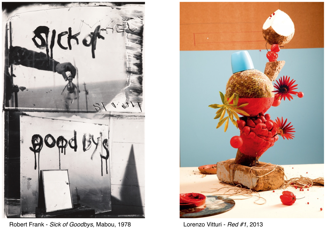
In the first photograph by Robert Frank I think the top half of the photograph was taken through a window and on the window it says 'sick of'' the backgrounds a sea with an arm reaching out and holding a small toy skeleton, there are smears on either side of the window and has a very creepy atmosphere. The bottom half of the first photograph has two mirrors with the word 'goodbye' written across it. The second photograph by Lorenzo Vittuiari I can see a very abstract flower vase. It is the opposite of the other photo,full of colour and life. I can see a brick, spaghetti, flowers and a cup. The background is made up of three different colours, blue,orange and white. It gives of a very vibrant feeling. The picture by Frank is a still life, sea scape and portrait however the picture by Viitturi is just a still life. The unusual thing about the first picture is the skeleton, staring straight through the window, as if it can see something. I am surprised by the brick in the second photo because it is such a heavy object where as the rest of the photo gives a very light mood.
The main similarities between these two pictures are they both split up into sections, they also both involve shadows of different objects. The main difference between the photos are the first has no colour and the second has lots.Both photographs were also made very differently. The second has been man made by different objects whereas the first doesn't really look as if it has been set up (even though it has). The picture by Vittuiari has a kind of flower pattern. In the photo by Frank it seems like there is a lot of space because the sea stretches out all the way however in the other photo you can see only a certain amount of the background. The most interesting part of the second photo is the spaghetti on the ground because it is so random. The most interesting part of the second picture is the skeleton because it makes my wonder why the photographer felt the need to put it in the photo. I also think the words 'sick of goodbye' are very interesting because it makes the people viewing the photo think about what he was thinking while taking the photo.
In the first photo you can see the edges of the shadows and the mirrors and it looks like you can see the edge of the sea. In the other photo I feel like there is no edge, the shape/object is never ending and includes so many random things. Both the photos make me think about the fact that in real life 3D never really have an edge however when you take the photo, it automatically makes anything 2D, giving it an edge!If I could ask Robert Frank one question it would be 'why did you spell goodbyes wrong? Was that on purpose?' If I could ask Vitturi one question it would be 'how did you think of this?' Because it is such a random concept.
Looking down:


For this task we had 25 minuets to take 20 photographs based on looking down, i really enjoyed this activity, i noticed many different strange objects on the floor that I wouldnt have noticed on a day to day basis. I found things like pennys, wrappers, crisps and took a photo of each thing i noticed 'looking down'.
WWW: I succesfully took 22 photographs each relating to our theme, i found different objects and colours to involve in each of my photos to make them more interesting and each one is different.
EBI: Next time i will centre each object more and i could involve different angles in my photographs that still looked down.
I think the point of this excersize was to help us realize that there are so many things we walk by on an everyday basis that we dont notice and this really helped me look aroud and notice my surroundings.
Object clipping:


Today we took photos to use in photoshop on object clipping. These are the photos I took, I like how they turned out and think some of the will look really cool once I've photoshopped them however I didn't have time to do that today.
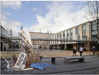
Paper sculpture- Frank Gehry:


This is the sculpture I made out of different strips of paper. I don't like it, I dislike the structure and don't think its very interesting or asthetically pleasing, the only thing I like is the colour scheme. We took photos of our sculptures against different colour background, my favourite is the blue because it makes the colours I used pop the most. Next time I will definitely frame my pictures better.


